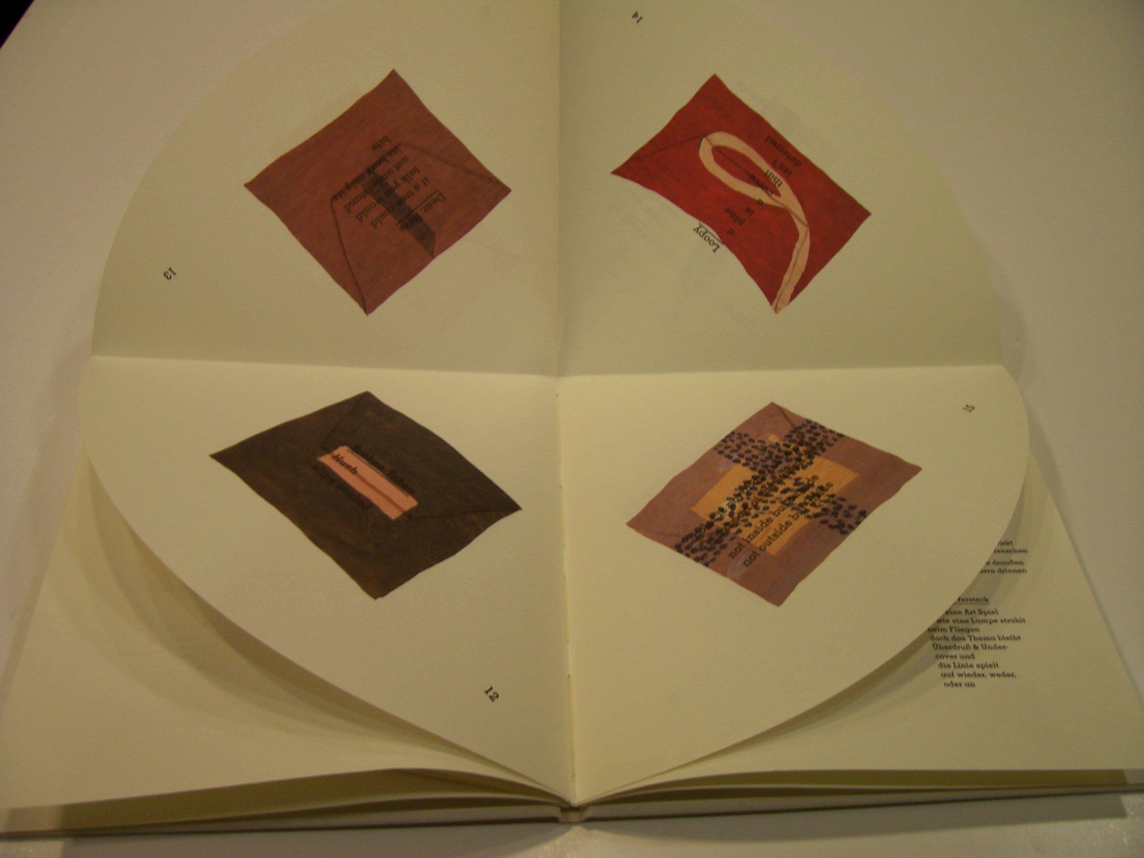
“Where the fold should be / There is no fold” reads the entire tenth poem of Reading Red. Reading this poem is a jarring experience: the book has many folds, extra folds. Is the “fold” of the poem related to the physical construction of the book in which it is printed, or is it a statement about something outside the book? As this poem makes clear, the work is concerned with the physical form of its presentation.

The artists’ book Reading Red is a 1998 collaboration by the artist Richard Tuttle and the poet Charles Bernstein. The book consists of 25 images, reproductions of Tuttle’s paintings, paired with 25 short poems by Bernstein. Instead of printing the poems and paintings on regular page spreads, Tuttle designed the book so that the pages fold out into three large circles. When the book is closed, these folded circles look like normal pages. When the book is opened, the circles unfold as the poems are read in sequence. To physically read Reading Red, we must either spin the book in a circle or walk around it. The exciting structure of the book sets this work apart from other, conventional collaborations between authors and artists. As an artists’ book, Reading Red seems to be a collaboration among painter, poet, and book form.
I first learned about Tuttle and Bernstein’s project when I found the artists’ book at the Hirshhorn Museum and Sculpture Garden Library. The Hirshhorn has a collection of artists’ books, most of which were made by artists in the museum’s permanent collection. Several of Tuttle’s works are owned by the Hirshhorn, including his 1967 Tan Octagon.
Though the artists’ book Reading Red is a complete work, the project exists in different forms. Paired in Reading Red, the paintings and poems can also be experienced separately. Tuttle created the paintings first. Only after viewing the paintings in a gallery did Bernstein respond by writing the poems. His poems for Reading Red can be found in other places, including his 2006 anthology Girly Man. There is even an audio recording of him reading all of Reading Red on a radio show.
In the artists’ book, Poem 10 calls attention to the book’s strange form. “Where the fold should be / There is no fold,” Poem 10 reminds me. Instead of a lack of folds, there’s an excess of folds in the pages. The poem is barely legible on top of Tuttle’s painting, as if the page is purposefully designed to make reading difficult. The painting almost seems to depict a piece of paper or even part of an envelope, with lines that might represent folds. One painted, fold-like line intersects with the poem’s line “There is no fold,” as if the painting contradicts the text.
Looking at the Reading Red poems printed in Girly Man, the text looks somehow quieter. 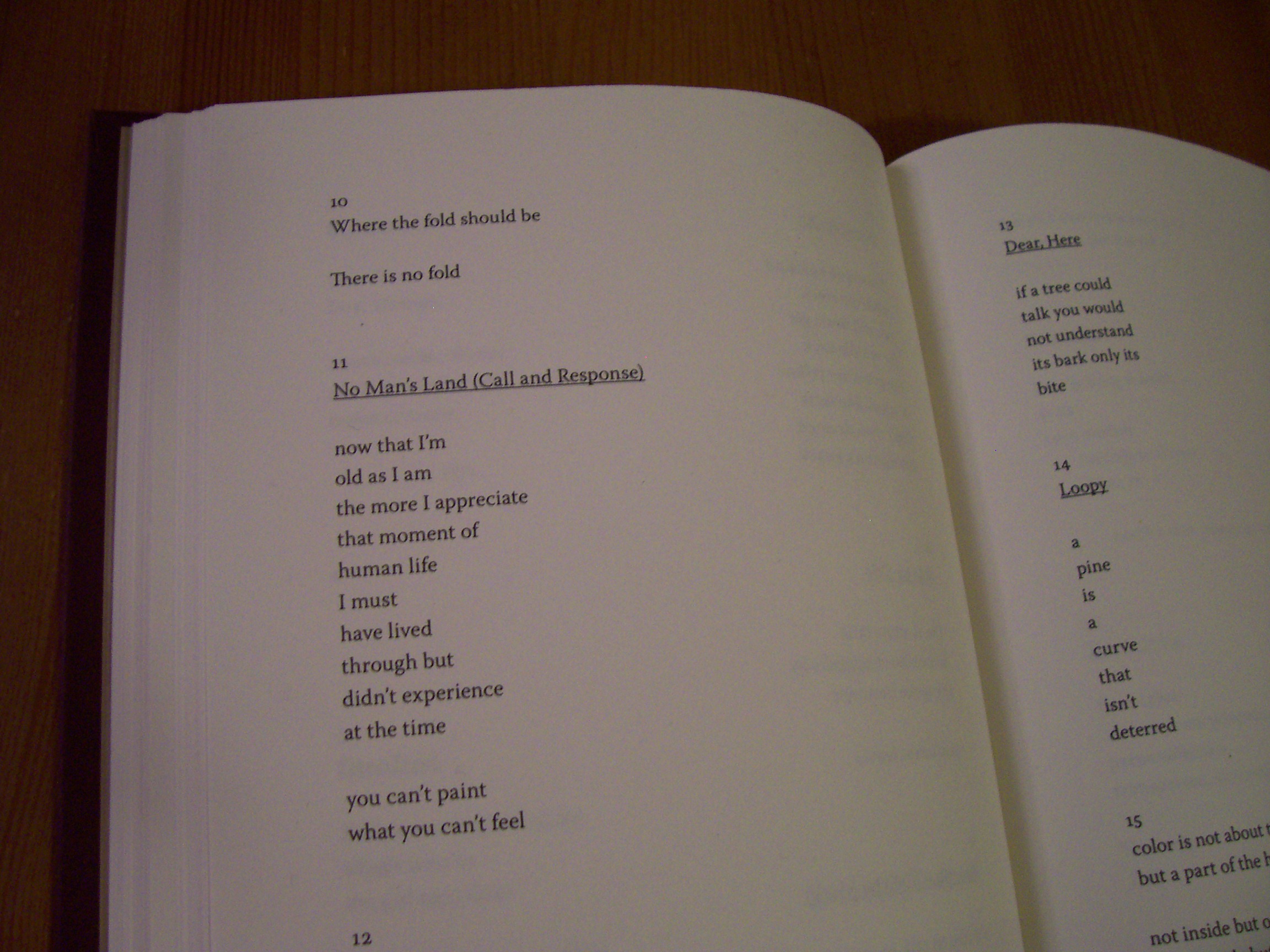
When the poem is viewed in the anthology, there’s just the normal number of paper folds in a regular book – no circular folded paper, no painted folds. The poems are no longer in direct conversation with the paintings and the foldouts. Now I read this poem with the memory of other folds and structures, other colors and circles, other ways of reading. Poem 10 speaks of a lack: there is no fold where the fold should be. In the artists’ book, this statement is peculiar and ironic since there are so many folds. But when I read it in the conventional book, the text’s reference to missing folds now alludes to its own form, since I know how the poem looked within the artists’ book. Set on a normal page spread, the poem is missing the extra folds it once had. What Poem 10 suggests is that the way a text is presented matters. This poem means differently when it appears in each of its forms.
So how do we read Reading Red? This question is really a number of different questions. How do we read a work that has so many different versions and forms? Do we read the poems differently when they are printed on top of paintings and folded into circles than when they are printed on plain white paper in a conventional book? And how do we actually navigate the text and images and foldouts of the artists’ book? Do we look at all the paintings and read all the poems in sequence, or try to absorb them together? Do we spin the book around on the table or do we keep it stationary and walk around it?
In a typically sly and playful linguistic move, the work’s title slips between “reading read,” as in the present and past tenses of the verb “to read,” and “reading red,” the unlikely act of reading a color. With such a title, one might expect the color red to dominate. Although Tuttle does occasionally use red in the paintings, the colors blue, brown, and orange appear more frequently. Rather than a literal comment about color in the paintings, the title points to the different ways in which words, art, and books can be read. The possibilities of reading are already pushed by the title before the book even begins. There is no single way to read Reading Red. In fact, there is no single version of Reading Red. Each reader can choose one or more ways to navigate the work. Come to the Hirshhorn Museum and Sculpture Garden Library to see the artists’ book, pick up Bernstein’s Girly Man, listen to the poems and see how you read Reading Red.
– Michelle Strizever
Michelle Strizever is a Smithsonian Institution Libraries Professional Development Intern for artists’ books. She is completing an MLS at the University of Maryland and holds a PhD in English from the University of Pennsylvania.
Be First to Comment