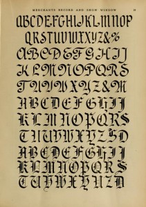
There may be a bit of truth to observations that we’re less patient now than we used to be. Look at this article found in the 41st volume of Merchants Record and Show Window.
This month we show the capitals which belong to the three lower case alphabets shown last month.
So begins an article on choosing fonts for department store window displays, circa 1917. There must be a hundred social and cultural reasons why it was okay to dole out information so slowly back then. Some combination of expectations and tradition resulted in a two month time lapse in order to access a complete font. These don’t even include special character sets. Jeez.
But even then they knew that all-caps script fonts were trouble! And I quote:
It is always well to remember that a page of all free-hand pen lettered caps never looks well as shown here–nor will any card or line of lettering made of all caps of these three styles look well.
Another difference that is always so stark as we read about life at the turn of the last century through the Cultural Heritage Library is the absolute nature of the prose. It’s all, always this and never that. The rules of engagement for socially acceptable norms were unquestionable back then. One did not question them.
For the most part, they seem to be right about that. But there IS one place all-caps script fonts always look good. Across the torso of gangster rappers.

Be First to Comment